Evaluation for Music Magazine
For my AS Media Studies coursework I was given a brief, the brief that I was given stated that I have to create a front page cover for a music magazine, contents page and also a double page spread. This had to be of my own design and ideas and it needed to have my own images of a minimum of 4. To start off I had to do some research on conventions of music magazines and researched upon different types of genres of how they are laid out and what style they are created in. This was conventions such as text sizes, fonts, colour schemes used, images and strap lines etc. For this I analysed magazines such as Scratch, Kerrang, XXL, Q, NME, they was all different types of magazines so that I could show and analyse different types of magazine genres to see how they are created and what the differences are to help me when I created my own.
When I created my music magazine I used Adobe Photoshop to create it, on this I used various different types of editing techniques, this was things such as cropping, editing images, coloured texts, fonts, outer glows, strokes, paint brushing or blurring several things on an image and various other things. I used various different types of editing because this makes my music magazine look more eye catching and attracts the readers and viewers attention more if it was to be on a shelf in a stack of magazines.
For my music magazine front page, contents page and double page spread that I am creating, I have decided to target it towards the ages from 16 to 24 year olds, this is because I know how this age group like the music industry genres and it would be easy for me to target it towards them as I am in the same age groups. For my model that I chose to use for my music magazine I had to make sure that he and the front cover was represented well and made sure that it used all the conventions that a front cover must use such as strap lines, edited images, barcodes and the price. I controlled all aspects of my mise-en-scene such as the colours, texts, clothing and the themes and other internet images used. This was done by me on my music magazine by me adding the clothing that I picked on my artist, also I designed the colour scheme from similar grime magazines that have already been published. The colour theme that I used was mainly black and then orange with bits of white in some places such as on the outer glows of the images and texts. I used the colour black as this fits into my music category as the grime scene most of the artists dress in black, the orange colour came from some of the other music magazines that I have seen in the Hip Hop, Rap, Grime genres that it stands out and goes really well with the black theme.
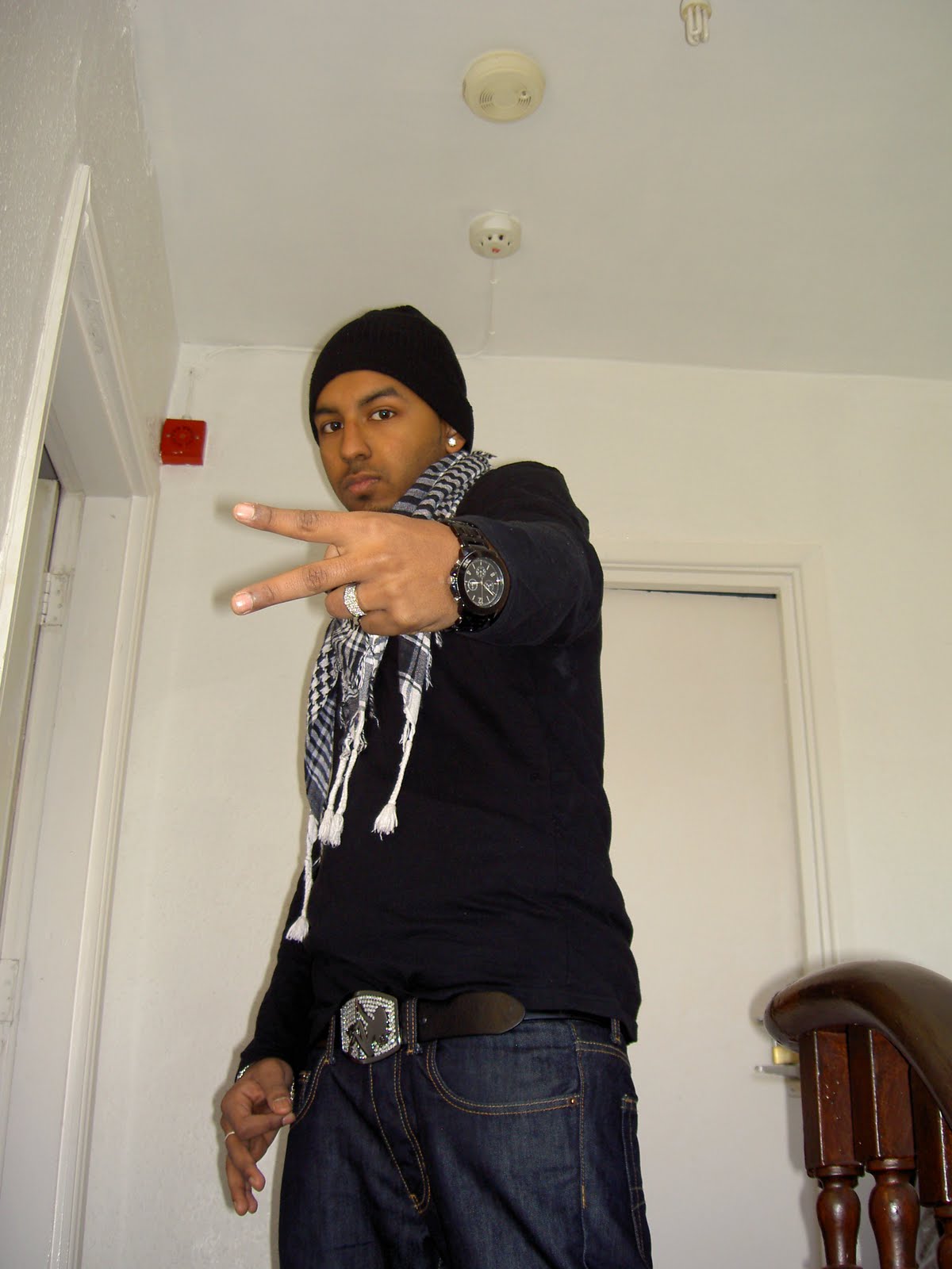
I picked my particular model because I think he was the best person to represent the Grime music genre for my magazine. When I say represent I mean that he is a male and mostly in the Grime industry it is always males that represent it but sometimes there is also females, but for mine I decided to go with male as he is the most appropriate person that I could find to do my images on. When I took my images I made sure that I took several images and lots of different shots and angles so that I can make sure I have enough to choose from and then also some to show as I didn’t use them and reasons for why I didn’t use them. The shots that I took were of lots of different angles, this was such as close ups, medium close ups, long shots, close shots and also some from lower and higher angles. The lower angles ones were so that the artist looks like he is in power over the audience, but these wasn’t used as any of my images. The model was dressed in 3 different outfits and the 2 that I used were the best type and fitted into my music genre perfectly. These outfits were good towards my genre and fitted in because I made the artist wear black which goes with the genre of Grime and the theme is black and orange which means that the artist wearing black would make him be part of the splash.
For my front cover the image that I used was a medium close up shot, this was enlarged and made bigger on the page so that it shows he is in power and his hand made contact with the audience and attracted peoples attention. I edited the background out of this image as it was in a hall way of a house, this was then placed on to a plain black background which went really well with the image. On the models image I edited it in three different places, one of them was that I made an outer glow and stroke on the outline of the image so that it stands out on the black background and so that the audience can see where the image finishes. The second thing I did was made the ear ring shine and sparkle on the page, this was to show that the model is wearing a lot of “bling” as this is how the grime artists are to be known to wear a lot of shiny jewellery. The third thing that I edited/placed on my artists image was that I placed a Ralph Lauren logo on the hat to make it stand out as it looked to plain and boring so I made it stand out with a white logo. To edit all of my images and backgrounds I used Adobe Photoshop CS3, I edited the images because of the backgrounds I took them on were in a house and I needed to take off all of the backgrounds in the images so that I can paste the images on to my own modified backgrounds.
After I placed this on I then added a masthead this was made in big bold and chunky text, I then made the texts colour orange so that it stands out on the black background. The masthead layer was then moved behind the artists image so that the artists image overlapped the masthead and showed the audience that he is in power on this cover. On the right hand side of the artists image underneath the masthead this stated a slogan and it was created in the same font and text colour as the masthead so that it was seen as part of the music magazine and nothing to do with the inside of the magazine.
Under the slogan/strap line I then placed the date in a different colour but the same text font, the colour was changed to white so that it stands out and that it will be easily seen of what months magazine this is for as a convention. Below this I then added text area which stated there is a free mix tape included inside this magazine with an image of an album cover, this is because this would attract lots of audience customers to buy the magazine just for the free CD inside. After I had filled in the space on the right hand side of the artist, I then filled in the left hand side by adding what is inside this magazine in big white text and then below this I added two different white texts stating main things inside this issue and then below this in orange I stated a interview which is on a double page spread with the artist “Kay”. Kay is a new artist, I think people would buy it more as he is new so that they can see what he is like as he is a new artist coming on to the Grime scene and he may become big and also may be really good at making songs within the Genre industry.
On the left hand side of the artist that I have taken an image of, I placed a car which goes with the theme of my magazine cover as the colours are orange and black which is the same colours as the background and texts that are on my overall splash. I used a car as lots of Grime artists are known to have nice and flash cars, this attracts lots of people towards them as then they are seen to have lots of money and some seriously good style. The car also relates to my genre of grime artists, this is seen by most of the grime genre artists having flash and expensive cars which represent that they are rich and that they know there cars. On the car image I added a outer glow and stroke in white so that it stands out with my main image of the artist, but the glow that I added on the car was a thinner and smaller one so that my artist is still the dominant and main part of my splash.
Below the car within the bottom left hand corner I added several logos such as “Star In The Hood” and a few others which relate to the magazines artist and the overall music magazine genre. Star in the hood; is a big make in the Grime industry that lots of artists wear and represent as they are famous and try to say they are the star in their home hoods.
Opposite this on the bottom right hand corner I added the barcode for my music magazine which is used to be scanned and entered into the till in the shops, above this I added the price which was stated at £2.99 and placed it in not too big and not too small just above the barcode. It is at this price as it is reasonable and cheap for anybody to buy, for example students who do not work or people who cannot afford a lot of money would be able to afford it. Also at the bottom at the centre on the artists top I added the website URL for the magazine, this will help the readers know that they can see more about the artists and the music genre on a website.
Finally overall I think that my front cover looks very professional and the image that has been captured of the model artist looks really well edited and has been set out on the splash very well and the theme that has been used goes well together excellent.
The next thing that I am going to talk about is my contents page that I made for my music magazine. On this I used the same colour schemes and the theme carries on from the front cover and on to the contents page.
The colour theme has been passed on in to the contents page by the masthead text colour being orange and the same colour as the front cover was, also the background was in a black colour which is exactly the same as the front cover. On this I added an image of my artist with another outer glow and stroke around the person, this glow was a lot thicker and more solid than the front covers, this shows that this image is not meant to be seen as a main area on the contents page and is meant to be seen as a background. This is because on top of the image I added a grey area which text will of gone on, the grey area was a transparent area which you can still see the background of the artist and his microphone and you can still read the main text and areas of the contents page. The microphone represents that he may be in his studio and he likes his microphone in the background as it shows he is a music artist.
Below the masthead I added a tribal pattern, this was to fill in the empty space but it also goes with my magazines theme as it could also represent tattoos and lots of grime artists are seen to have tattoos on themselves. They connotate as when they have tattoos as they are known as rough and to be tough people which means that they could be very violent.
At the bottom of my contents page I added a big banner which says Grime Factor, this attracts a lot of attention to the reader as they will want to know what this is about and they will want to know more so they will look through the magazine and find out what this is all about.
Finally I created my music magazines double page spread, on this I carried out the same colour theme. The black was used for the background and then I created a masthead which stated “Kay’s Time Is NOW!” this was done as the artists image that I had taken and used had the artist looking down towards his watch. This shows that it is his time now and the word “now” was written in a big capital lettered text. The shot I used was more of a close up and medium close up as you can see more of his top half of the body than just his face along with the watch.
The image of the artist was edited as so was the homepage and the contents, it had been edited by adding on a stroke and a outer glow in white which faded outwards this shows the reader that they are still reading the same magazine and it will help them know that it is the same artist with the same editing that has been done to the splash.
The double page spread was split into two sections, the left hand side had the artist filling up nearly all of one half with his name “Kay” and the second half on the right hand side had “Time Is Now” and the interview which was mentioned on the front cover. The interview that is shown for the artist is about his life and he replies with honest answers and tells the reader what his life has contained and how he got into the grime music genre and the grime scene. Finally at the bottom of the right hand side on the bottom I have added another image of a car this could represent that the artist is interested in cars and the main cars would be Audi’s, the front cover has a Audi Q7 and this double page spread contains an Audi R8. To the audience this will look like that he has very good taste and that he also has a lot of wealth.
Finally I added a website URL link for Facebook, this is of the artist as then the audience that it targets towards can then follow him and keep following him up on updated news through the internet on Facebook.