Tuesday, 14 December 2010

Third Analysis of Music Magazine Contents Page


Language:
This contents page is from the Kerrang music magazine, Kerrang is a Rock genre and this has been shown by the images that have been used. The masthead shown on this music magazine's contents page has been created with yellow text and a black background. Also all of the other sub-headings that have been placed are on the opposite type of the colour scheme rather than the masthead which is that they are in black text and yellow backgrounds. The overall colour scheme that has been used on this contents page is quite plain which is black, white and bits of yellow on a few places.

The information has been well organised and presented, it has a lot of different information and there is also a box on the top left hand corner of this magazine which shows the front cover of this particular music magazine. This is good for the reader because it reminds them what magazine they are reading and that they can still see the colour scheme.

On this contents page there are also 9 images that have been used with number of the pages, they are all the same size apart from one which has been created bigger and stands out more which shows the reader that this image is the main part of this magazine and contents page.  The images tell the reader what is inside the magazine and also the images will let them know who or what it is instead of just written text being placed.

Institution & Ideology:
The institution and ideology for this magazine's content page is that they want their reader to understand the contents page correctly, understand the images and text that has been used and finally to make sure that the readers are capable of keeping on track of the colour scheme and the way that it has been presented.

Audience:
The target audience for this particular music magazine's content page would be that it is to do with rock which means that the target audience they are aiming at has to be rock genre fans. It would be towards middle aged teens up until middle aged readers. The main area is the rock genre, it is shown by the images that have been used on the contents page are linked towards the Rock genre.

Representation:
The representation for this music magazine is for rock fans, it has been shown from the way the artists on the images have been presented.

Saturday, 11 December 2010

Second Analysis of Music Magazine Contents Page


Language:
Here is a contents page from an NME magazine, it is published weekly. The masthead on this contents page has been created in a black bold font on top of a white background. Next to this is the logo of the NME music magazine, this has been placed on the white background and the logo NME has been created in red with a space outlined with a black outline which makes a white border then a black outline to the logo. The left hand side has a red background and contains the Band Index, this includes different band names and artists. On the right hand side of this contents page There are sub headings in white bold text and black backgrounds on the fonts, these show the latest News, Radar, Reviews, anything that is appearing Live and finally what the magazine Features.
The bottom of this contents page there is a black area with bright text saying that if you subscribe today you will save 33% and it also tells the reader what to do and who to call if they are interested in this.
The bands images that have been used have been taken whilst they have been performing somewhere live last week as it says this in the text below the images of the band which also tells the reader that this was them recently at a tour performing live.
Another main part on this contents page is that one part of the text overlaps the bottom of the left image saying "The moment that..." and then under neath this there is big bold black text which reads "...Oasis kicked of their world tour". This shows the reader that it links to the images that have been shown and that this is where they all started from and where they became famous from.

Institution & Ideology:
The institution and ideology for this type of magazine contents page for the NME magazine is that they want their readers to read it easily and make sure that they want to read more. They also want to make the readers want to know what is included inside the magazine and make them read more and more of the magazine. 

Audience:
The target audience that the NME music magazine and the contents page target their audience to is late teens till middle aged people, also they want to target it towards the genre of rock fans. This is because not many young teens or very old people listen to this type of genre "rock" and if they do it is only a minority that do so. Another target audience for this type of magazine/content page would be for the audience fans who like to be like the band that has been represented on this contents page.

Representation:
The representation for this NME magazines content page is the rock genre this is because the images that have been used represent rock music and it is middle aged/younger people.
It will also be represented for the audience who like to dress up as the same as the band or artists that play or sing rock music.


Thursday, 9 December 2010

First Analysis of Music Magazine Contents Page


Language:
Here is a contents page from the Q magazine that is published monthly.A contents page is to tell the reader what is included or featured within the magazine, they are always on the first page of a magazine which is a really good place for them to be because they help the reader know what each page is about and if they are looking for a particular topic, they will also know what page it is by looking at the contents page rather than searching through the whole of the magazine.

The masthead on this contents page is in white and it is also bold and stands out as it sits on the black background it has been designed on. Also next to this is the Q logo which also stands out as it is in white with a red background. The sides show that there is the monthly features in this magazine and upcoming monthly ones too, these are all designed in a red background with white text which then have the information underneath them. All of these attract the readers attention straight away as they are colourful and also bold texts, fonts and sizes that have been used. The features are what is inside the magazine, these are placed on the left hand side of this contents page as you can see from the image above. The Q magazine also add a "Every Month" section in the corner of the contents page, this will which is another thing that they have added for the audience and readers to know what is going to be included within this particular magazine for each month or the current month that they are reading the magazine in.

The image of a band that has been displayed on this contents page would be a full low angle shot, this is because all of the band members are seen from head to toe and they are all stood higher than the camera has been placed. This shows that the band are in a higher position than the readers which could suggest that they have more power than us and that they are more popular because of the music that they produce.
 
Institution & Ideology:
The institution and ideology for this type of contents page for the Q magazine is that they want there target audience to see it as an easy to read and understandable page to make readers look at it and continue reading what is inside this magazine and what else is included.
 
Audience:
The Q magazine generally targets it's audience at younger and older generations, this can be seen in some of there magazines they have young bands represented on there covers, contents pages etc but also on some they have older aged bands. But the main target audience for the Q magazine is rock fans, they always look at the target audience's who like the genre of rock music. Finally the age group for this contents page would most probably be more of a younger up middle aged people.
 
Representation:
The representation for this particular Q magazine's content page would be of the rock genre because it represents a young band that are well known to the fans of rock and they are liked by their target audience.


Monday, 6 December 2010

Third Analysis of Music Magazine Cover


Language:
This music magazine is by XXL, the artist on the front that is shown is P-Diddy, he is a famous artist that alot of people will know about. The masthead which is the name of the magazine "XXL" has been overlapped by the artists head in the photograph, this has an affect as it shows that the artist is over powering the masthead and he stands out in the whole splash. Another thing is that the artist has been captured in a black and white photo where as the masthead is in colour. The name DIDDY is center framed in this splash and it has been designed an created in big bold black text. The masthead has been created in a big bold and red font style and text which makes it stand out and lets the audience know what magazine this is even though it is not fully shown. The camera angle that the artists image has been taken at is a medium-close up, this is shown because the artists body has been shown and not the full body but not just the head either, it is from the below the chest and above.

Ideology and Institution
The designers and creators of this music magazine have created it to be aimed at the audience who like music within the genre Hip Hop music. This is shown by using the artist which has been shown on the front cover of the music magazine, he is dressed like most hip hop artists dress for example with chains and sun glasses.

Audience
The target audience that this magazine has been aimed at is people who like the genre Hip Hop music, or even like the artist that has been advertised on the front cover of this particular music magazine. XXL which is the name of the music magazine is a famous music magazine for the Hip Hop genre, which means that the target audience will always know when they see the masthead of the magazine in shops.

Representation
The representation of this music magazine has been shown from what the dress sense of the artist on this music magazine is wearing. This could target towards people who like to wear the similar sort of clothing accessories such as chains and sunglasses.

Thursday, 2 December 2010

Second Analysis of Music Magazine Cover


Language:
The masthead on this KERRANG music magazine cover has been created in a very affective way. The masthead's style is as if it has been smashed with something, this can also be seen as strings of a guitar the way the lines of the cracks on the masthead have been laid out and also the sound of a guitar string is a similar sound like "kerrang". The font of the masthead is also BOLD this makes the masthead stand out and it creates a strong and aggressive sort of tone to the audience it appeals to and represents itself to. This bold and black tone on the masthead also links to the artists that are shown on the front cover of the magazine, the main artist who in the center of the splash "Simon Neil" has be presented in the middle of the magazine in the white hooded top. This makes him stand out of the band as the other two band members are in black clothing. The link between the artists and masthead are that the main thing on the magazine's front cover is the masthead as it tells the audience which magazine it is, and then the main artist from the band is in the same colour and represented with the same boldness style which shows the target audience who the main artist is within this magazine.
There are two camera angle shots that have been used on this magazine's front cover, the first one is the artist that is centered in the middle of the magazine's cover, he is shown as a medium close up. The other two artists on either side of him are more of a close up shot as on the two artists behind the main centered artist, they are closer in towards there face where as the main artist has more of his center and upper body showing in the image.
There is also advertisements that have been promoted and shown on the bottom of the magazine's front cover, this shows that there has been a lot of money put into this magazine and it is a decent magazine to purchase.

Ideology & Institution
The people who have designed and created this magazine front cover have designed it to be aimed at the target audience who like rock music. This is shown because they have used the images of artists and the band who play rock music and the target audience will know this when they see the images of the band displayed on the front cover of the music magazine. Another thing is that Kerrang is a rock magazine, so when the audience see this they will know 100% that this relates to them if they have interest in this type of genre in the music side. 

Audience
The target audience that this music magazine relates to is people who like the genre of rock music, this is shown by the name of the magazine which is the masthead saying Kerrang as it is well known to be one of the top rock music magazine's and also the main band that is represented on the magazine shows that it is a rock music magazine of the way they are presented to the target audience. 

Representation
The representation for this music magazine's front cover has been aimed at the target audience which is for the people who are like the band shown on the cover or who like the music that the magazine represents. The type of clothing they wear could also be a representation to the people whom it targets towards.


Wednesday, 17 November 2010

First Analysis of Music Magazine Cover


Language:
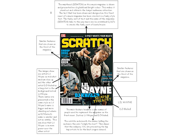
In this music magazine front cover there are two camera angles used to take the images that are designed and created on this magazine cover. The first one is of the main person who is represented on the magazine cover which is LIL WAYNE. He is presented to the target audience as a mid-shot medium close up image, then there is the second person that is represented in the magazine front cover which is DJ KHALED who's image is captured as a long shot shown in the background of Lil Wayne. This is shown as the DJ playing the music is in the background and the main thing in music is the person who is singing which is the mid-shot image in this photo. This shows the connotation of the shot as Lil Wayne is presented as the main image and that he is in power which is why he is shown bigger in the splash. Also the names of the artists that are represented in this magazine cover are shown in the same way that there images are, this is shown as Lil Wayne's name is much bigger and bolder than DJ Khaleds is and doesn't stand out as much which is just like the images that are shown to the target audience. The artists are also either doing something or holding something which is musical, such as the microphone and then the DJ decks.

Ideology & Institution
The people who have created this magazine are "XXL" as it shows there name on the top left hand corner of the magazine's front cover. It has been designed to be aimed at people who like the artists that are represented on the front cover and also the genre of music that is represented is another way of them to target it towards the audience that they have chosen.

Audience
The target audience that has been chosen for this certain magazine is people who like to listen to Hip Hop, R'n'B, Grime, Rap etc. This is shown that it is to target it towards them because the artists that are represented on the front cover of the magazine.

Representation
We can see that the representation of this magazine shown from the magazine's front cover aimed at people like the artists represented in the music magazine's cover. This can be things such as the music they create or even just because of the artists that are represented in this type of genre. The colours that are used affects the music magazine's attention by the creators making the masthead and all of the other headings or smaller features that are used are very bright and stand out.

Friday, 12 November 2010

Link of Music Video for same Genre


This is a music video that I have posted of what my Genre "Grime" sounds like. This song contains several rap and grime artists such as Giggs, Tinchy Stryder, Tinie Tempah, Chipmunk, Devlin, Professor Green etc.

Identifying and explaining my choice of music genre

The music genre that I have chosen to do is GRIME. Grime is music that is a genre of Urban music and mixed with rap hip hop.
I have found that from my conventions for my genre which is Grime, that the sort of clothing they wear is different to other people. They wear baggy clothing, hooded tops and lots of jewellery. Grime can often be dark and aggressive, featuring MC's as opposed to singers and getting rid of the R&B influences of earlier the UK Garage music.

Saturday, 6 November 2010

Main Task - Research

For my main task, research will be carried out and I will be comparing the contrasts and identifying the conventions.

I will do three of each of the following:
- 3 Front pages research.   
- 3 Contents page research.
- 3 Double page spread sheets research.

Main Task - LIIAR Interpretation for Brief

LIIAR:
Language:
In Media Studies, camera angles are a main vital part in magazine front covers. This can include things such as the camera angle, the positioning of the camera, the distance that is used for the shot of the image and finally the layout that has been created which is also known as the "splash" as the final product.

Conventions and codes are also part of the research which will be used for the music magazine front cover

For example the scenario of a music magazine front cover will be a medium close up shot to show that the main focus of the magazine is to do with the band or the artist that is being advertised and who is promoting the magazine.

Institution:
The institution on a music magazine front cover would be the people who have designed and created the magazine, for example some music magazines have the name NME, Q, MIXMAG, placed on the front cover of the magazine standing out as the masthead which are the creators and designers of the magazine. 

Another thing that links to the names of the magazines are the EMAP's and the IPC's. EMAP is the second largest UK magazine publisher with 16% of the market shares, it is also known to be competing with the IPC Media for lead positions. The IPC Media is Britain's largest magazine publisher, with having over 100 titles and 22% of the market, selling 350 million magazines a year.

In this section of media the term Synergy is used, this is the two aspects of media using people to promote the product. The term synergy means the coming together of two separate media texts in such a way as to benefit both. It usually means that the combination of elements has a greater effect than the individual elements would have alone. With media texts, for example, this can mean that the simultaneous release of a film sound track will stimulate greater consumer interest than if the products had been released separately.

Ideology:
The ideology in media for a music magazine is the values, morals and the messages that are shown. This can be people who make it, or even the places and people that are represented and their values that are shown or used. This can also be known as aspirational.

Audience:
In media the target audience is important for the making of a product such as a music magazine. The target audience normally covers the age groups that are represented, the gender that the magazine represents and also the social classes that it targets towards.
This can be classes such as the following:
A - The A class is known to be the upper middle class for example the Doctors and Consultants etc, in other words the people that are known as the word posh.
B - The B class is known as the middle class for example the Liberians, Lecturers and Teachers etc.
C1 - The C1 class is known as the lower middle class for example Police Officers and Nurses etc
C2 - The C2 class is known as the skilled working class for example the Plumbers and Electricians etc.
D - The D class is known as to be the working class, for example this can be people such as the Shop Workers (Shop Checkouts) and workers in MC Donald's etc.
E -  The E class is also known as the under class for example the people such as Casual Labourers, Students and Pensioners etc.

Representation:
The representation in media is known as the image to represent your target audience. This can be aspirational. This can be re-representing society back to us such as the images and values.
Presenting the aspect of society back to us, what the target audience aspires to.

Once again in this section of media the term Synergy can also be used which is the two aspects of media using people to promote the product.

*For my magazine cover I will create a Website URL for the official website of the magazine, or even a Facebook group page which will be written on the front cover that may be used to advertise my magazine.*

Main Task - The Brief...

For my main task I have been asked to design and create the front page, contents page and a double page spread of a new music magazine. All the images and text used will be original and they will be produced by me, (there will be a miniumum of 4 images).

Friday, 22 October 2010

Unused Images

I didn't use this image because it wouldnt of gone well with my background as my students image will have been too close for a medium close up to have used on this background image. Also another thing is that it will be a better image to be used for the inside of a magazine more than the outside on a front cover.

This image above wasn't used because it was also another image that would be better to be used on the inside or on the contents page. Also the image has a person using a locker which wouldnt have looked too professional to be used in a college magazine front page.


This image was a good picture but the bad thing was that if I used it for a background the people walking in would have made it look unprofessional and also the bikes on the left hand side wouldn't have all been covered up by the students image that I used.

This image was a great image and an excellent shot of the reception area, but the reason why I didn't use this was because it doesn't represent the outside of the college to show what it looks like on the outside and finally this would be a perfect image to use on the inside more than the front cover.

I didn't use thisd image because the male student used on the right hand side wasnt stood in an appropriate professional way to be used on the magazine and also the book that they were looking at wasn't held in a presentable way.

This image was also not used because of the way the note book was held by the female student on the left hand side and also the male student wasn't fully ready when I took the shot for the image.

My planning and drafts for creating my final design.


This above is my planning for my slogan and catch phrase names that I planned to create. I thought about 7 different types of slogans then in the end I chose to use "Strive to be ambitious".

This image above is my planning for my magazine cover, on this I planned out were I will place my image, information texts and slogans etc. On this in the end I ended up editing a few things to make my magazine cover look more professional and for it to look much better.

The image above is a draft of my contents page, on this I planend out where I will layout my images, advertisements, the title of the contents page and also the topics and what page numbers they are located on.

Magazine Front Cover Evaluation


The camera angle I used in my magazine front cover was a medium close-up image, I captured the picture at a slightly low angle and the connotation of this is to show that they are in power. This wasn’t an obvious camera shot of a low angle but if you look carefully it is slightly at a low angle. The students are holding a note pad which represents that they are talking about there education. When I was taking my images I took into consideration that my image needed to be about education because I wanted it to reflect my institution which I feel it did do so.

The mise-en-scene of this image shows the background being the college which contrasts with the students holding a book which may contain work inside it that they are discussing. I used a background image of the new building at Wyke College because it shows that the college is very well presented, clean and tidy, also it will attract peoples attention to a college that is represented as well as this one. I decided to place the image of the college because it represents a new and modern college, this may be read by the students parents or guardians when they take the magazine home which will give them a positive side of the college and how well it is presented to the students. The masthead that I used is a large and bold font. It has a border around it with colour which makes it stand out from the rest of the page, it is a good text size, font and colour as it is easy to read. This is shown by the text that is used as it has a lot of affective colours used such as purple bold outlines.

The catch phrase “strive to be ambitious” shows that the target audience it is aimed at is for people who are wanting to achieve what they want and work hard to get what they want at this college.

I have designed this magazine cover to be aimed college students at Wyke College who are ambitious to learn and strive through education.

The target audience for this magazine is for students that would work hard and be ambitious about there education, also the name Wyke College is used twice which shows that it is all about this college to go to for an excellent education.

The representation on this magazine cover is aimed at any gender as the image shows, there is a female and male gender displayed as student models.

The conventions that I used in my layout design for my magazine cover were very normal and to the professional standard such as the masthead that was created and placed was in a original and normal place in the top center of the page, where as if I had located this in the center of the page it wouldn't of had the same affect as my final design had.

A disadvantage of my final design and creation of my magazine front cover was that I used green screen to capture an image of my college students. This is a bad idea because in my final design the hair of the female student had tiny parts of green which I couldn't amend or edit as Adobe Photoshop doesn't allow you to edit small amounts of the background area. If i was to do my students images again I would make sure that I do not use a green, or even any coloured background. I would make sure that it is in the same area of the background location so that it does not stand out of the main final image for my magazine cover.
disadvantages of green screen

Contents Page


Thursday, 21 October 2010

My Final Images


These are my final images that I used for my final design on my College Magazine front cover. The first image shows the background theme that my college magazine cover will contain, it is of the Wyke College and for this picture I didn't have to edit anything on there.

The second picture is of some students that study at the college looking at a note pad. This was edited when I used it for my final design as I flipped it to the left, when I flipped it to the left the students changed position from left to right and right to left.


Wednesday, 20 October 2010

Second magazine cover analysis


Language:
The camera angles on this magazine front cover is a straight forward view, the student for the image is standing directly in the middle of the frame. The person is directly looking at us and doesn’t have a serious face, but does have a smile which can show that he enjoys the college life and the subjects that he is doing there. He’s also making eye contact with the camera, connecting with the reader which makes them feel more involved with the magazine and the student lifestyle. The college student is wearing general black and white clothes which are a standard males formal clothing. Another thing in the term language in media is that the masthead on this college magazines front cover, the masthead is done in a very bright colour and it is bold which makes it stand out with its attractive bright colour. Even though the masthead is large area of the magazine it still doesn’t draw the attention away from the student that is modelling as the student is partly covering up the word college. If the student wasn’t covering the masthead of the magazine then maybe he would be overpowered by the mastheads bright colours and bold text.

Institution & Ideology:
The people who have created this magazine front cover have designed it to be aimed at people who would like to be living the college lifestyle.  


Audience:
The target audience is for the type that love going out on the evenings and weekends as the image shows that you can have fun on a night as well as attending college during the day. There are some catch phrases that are used on this magazine front cover such as “thank god its Friday”  this will make the target audience want to know what this phrase means, so they would buy the magazine and read through to see what they mean by this.

Representation:
We can see this as the model student is wearing more formal clothes and is carrying text books for subjects such as Law and Business, which are academic subjects as oppose to art or drama and many more. The magazine also aims at males as the colours are black and green, dark colours represent male stereotypes as appose to females. Another representation is that the male student that is used on this magazine front cover is of a different ethnicity, this is also showing that you can be of any ethnicity to be doing a course at there college.

First magazine cover analysis


LIIAR:

Language:
The camera angle of the photo of the student is a slightly low angle the connotation of this is to show that she is in power that you are looking up towards the student. The angle it is taken at is from a midpoint view, the student is also holding an object which is to do with the course that the magazine is representing. Mise-en-scene is used in a way here in the magazine cover, the background contrasts with the student doing the practical work, this is shown by the background having a graph in a science lab, this is showing that the background links with what she is doing and all her surroundings are to do with science to show that she is working in a science lab. Another thing in the term language in media is the masthead on this college magazine is a good size and font as it is really clear to read and also a big size which shows clearly what the college magazines name is.  It is very well presented for the target audience as it stands out very well and will attract the target audiences attention towards buying or looking at this magazine.  The colours used on the front cover are very affective, the student is wearing pink and black, and then there is some green text over the black background off her clothes which really stands out and can attract the target audiences attention. The main words for the magazine such as the college name, courses name are all in white colour, this is done for a reason so that they all stand out from all of the other text fonts and colours to show the main purpose of the magazine.

Institution & Ideology:
The people who have designed and created this magazine front cover have designed it to be aimed at college students that are interested in science at there college which is named “Beloit”, this is because they have used the term science and there own college name Beloit which is to make people think of the college and know that they do science there. This affects there final product in a good way, because there is a lot of language used such as camera angles, mise-en-scene and also the way that the student is presented has a great positive affect on the overall magazine front cover to show that it is to do with science at the college.

Audience:
The target audience that this magazines front cover is aimed at is, people who are interested in learning science at a college. This is shown by the college name being written in big standing out text in the mast head, also the word science is shown bigger than any other word on the cover and finally the student working is of different ethnicity which will now link to the following representation.

Representation:
The representation in this magazine is that the magazine front cover is aimed at people like the student used on the page who is a different ethnicity, and also a female gender. Generally scientists are known as white males, but this magazine cover shows that you can be a scientist or study science even if you are a female and Asian ethnicity. This then gives an idea to any other students like the one used that they are also capable of doing the same thing and you don’t have to be a male just to do science.


Tuesday, 19 October 2010

LIIAR

LIIAR

Language:

On my front page of my college magazine I will make sure I use the term “Language”. By the term language what it means is media language and the use of terminology. The camera angles that will be used in my magazine front cover will be medium-close up. By medium close up what I mean is that the body language will be from the middle area of the body upwards. Another thing that the term language includes in media is the masthead. The masthead is the title of the magazine which is normally displayed in the top left hand corner of a magazine. It is usually the visual branding of the title and is normally done in a unique typeface to be very recognisable.

Institution:

Institution in media is about who has produced the magazine cover and why they have done so. This could be things such as what style, colour and size text that they have used any piece of media such as films, adverts etc. Also what sort of images and camera angles that have been taken. The institution covers the areas such as who has controlled the production process and how does this affect the final product. 

Ideology:

In media, ideology is shared beliefs, the values and also the morals. It is about the people who make the magazine front cover, the people who are represented or even the places that are represented in the image and also their values that are created.

Audience:

The audience section in media is all about the target audience that is represented in the magazine cover. It is to see who the magazine is aimed at and why it is aimed at just a particular type of person. This can be things such as whose needs does it fulfil and what do people do with it. Target audiences include the area of “Demographic”, this could be to do with the age, gender and even the location of the magazine front cover. The covers can also be about psychographics which is about how the lifestyle is represented and presented to the audience and also the career that it may show. How you represent your target audience is another main area in media that will have to be covered, because different types of audiences make different types of meanings.

Representation:

Representation in media studies, is how the front page is designed and shown to the audience. This can be what sort of individuals or groups appear in it, what is excluded and also how they are portrayed. The representation can be how they are presented from the gender, age, sexuality, location, ethnicity, disability, social groups which can be conservative or challenging.

Friday, 8 October 2010

The Brief. 08/10/2010

My first task is the Preliminary Exercise, in this I will be using DTP (Desk Top Publisher) and also an image manipulation program to produce a front page of a school or an college magazine. It will feature a photograph of a student in medium – close up (which is the top half of their body) and also some appropriately laid – out text and a masthead (Title of the magazine).  I will also produce drafts of my contents page too demonstrate their grasp of the Desk Top Publisher.

My main task is to create the front page, the contents and the double page spread of a new music magazine. I will use a minimum of four images and my text and images will all be original and produced by me.

Tuesday, 5 October 2010